Pump Chunky: A Friendly Display Font for Digital Brands
As a UI designer who ships dozens of landing pages, SaaS dashboards, and e-commerce experiences each year, I pay close attention to how typefaces behave—not just how they look. Pump Chunky stands out because it delivers warmth without sacrificing clarity or digital legibility. It’s a display font built for moments that need personality: hero headlines, CTA buttons, product banners, and brand-led content sections where tone matters as much as function.
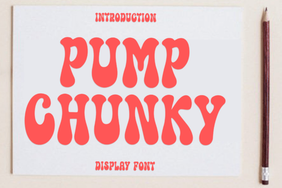
Visually, Pump Chunky features rounded, slightly uneven strokes—like hand-drawn lettering refined for screen use. Its generous x-height and open counters improve readability at medium sizes, while its relaxed proportions avoid the rigidity of geometric sans serifs or the formality of traditional serif fonts. Unlike many playful display fonts, Pump Chunky doesn’t sacrifice structure: characters align cleanly, spacing remains consistent across weights, and optical scaling holds up well on both desktop and mobile viewports.
Where Pump Chunky Earns Its Place in Web Layouts
In practice, Pump Chunky thrives where human connection is the goal. On a coaching website’s hero section, pairing it with a clean sans serif like Inter or Open Sans creates instant contrast: the headline feels inviting and personal, while body copy stays scannable and trustworthy. For an online boutique selling handmade ceramics, using Pump Chunky on product category banners (“Hand-Thrown Mugs”, “Glazed Serving Boards”) adds tactile charm without undermining credibility—especially when set against soft neutral photography.
It works especially well in conversion-focused areas. Buttons labeled “Get Started”, “Join the Studio”, or “Grab Your Spot” gain subtle emotional weight when set in Pump Chunky—its rounded terminals soften urgency, making action feel collaborative rather than transactional. That nuance matters on course sales pages, newsletter sign-up modals, and app onboarding flows where reducing friction is key.
Readability & Responsiveness: What to Expect on Real Devices
Pump Chunky performs best at 32px and above on desktop, and 28px+ on mobile—ideal for headings, short phrases, and decorative accents. Avoid using it for paragraph text or small interface labels (e.g., form field hints or tab titles), where its stylistic flourishes can reduce scanning speed. On dark backgrounds, ensure sufficient contrast—test against WCAG AA standards using tools like axe or Lighthouse. When overlaid on images, apply a subtle semi-transparent background or text shadow to maintain legibility without compromising visual rhythm.
The font includes multiple weights (Light, Regular, Bold) and supports Latin-based languages including extended diacritics. Webfont files are available in WOFF2 format—lightweight and widely supported—making integration into modern build pipelines straightforward. Always verify multilingual needs early; while Pump Chunky covers most Western European languages, it doesn’t include Cyrillic or East Asian character sets.
Smart Pairings for Balanced Digital Typography
Display fonts like Pump Chunky shine when paired intentionally. For web interfaces prioritizing clarity and speed, pair it with a neutral, highly legible sans serif: Inter, Manrope, or even system fonts like -apple-system for body copy and UI components. This combination reinforces hierarchy—Pump Chunky draws attention upward, while the supporting font anchors users in content.
For editorial or creative portfolio sites, try pairing Pump Chunky with a warm serif like Literata or Cormorant Garamond. The contrast between its friendly roundness and the serif’s gentle structure adds sophistication without stiffness—ideal for blog headers, case study titles, or “About” section leads.
Avoid pairing Pump Chunky with other high-contrast or heavily decorated display fonts. Its personality is strong enough to carry focus alone. If you’re designing a brand kit, reserve it for primary headlines and logo lockups—not subheadings, captions, or navigation items—where consistency and restraint amplify impact.
Licensing, Usage, and Practical Integration
Pump Chunky is a commercial font, meaning proper licensing is required for any public-facing digital use—including websites, client projects, SaaS platforms, online stores, and downloadable design assets like Notion templates or Figma UI kits. Most licenses cover web embedding via @font-face, but always confirm scope: some plans limit monthly pageviews or restrict use in white-labeled products. If you’re building for clients, clarify whether the license permits transfer or requires individual purchase.
When integrating, load only the weights you need—typically Regular and Bold—and preload critical display text in your font-display: swap strategy to avoid invisible text during load. Use CSS @supports queries to gracefully fall back to system fonts if Pump Chunky fails to load, preserving layout integrity.
Real-World Scenarios Where Pump Chunky Adds Value
- Creative portfolios: Use Pump Chunky for project titles and “Work” section headers—its approachability complements visual work without competing with imagery.
- Boutique online stores: Apply it to seasonal campaign banners (“Summer Studio Sale”), product tags (“Locally Made”), and email subject lines to reinforce artisanal authenticity.
- Coaching & course sites: Set session titles (“Clarity Call”, “Design Sprint Lab”) in Pump Chunky to signal accessibility and grounded expertise—not hype.
- Social media graphics: Export static banners or quote cards with Pump Chunky text layered over gradients or textures—it scales cleanly and retains character at common social dimensions.
- Brand identity systems: Use Pump Chunky as a secondary typeface alongside a primary sans serif or serif, reserving it for moments requiring emotional resonance—like welcome messages, testimonial highlights, or community announcements.
Ultimately, Pump Chunky isn’t about novelty—it’s about intention. It supports digital experiences where friendliness, clarity, and brand-aligned tone aren’t optional extras. When used with discipline—respecting its strengths, limiting its scope, and pairing it thoughtfully—it becomes more than decoration. It becomes part of how users feel welcomed, understood, and invited to engage.