Cream Bounce: A Display Font That Grabs Attention—Not Just Scrolling Eyes
It was 3:47 p.m. on a Tuesday, and I was finalizing the thumbnail for a YouTube series launch—a six-part “Summer Skill Swap” content series aimed at small business owners. The thumbnail needed to pop in under two seconds: bold, warm, unmistakably playful, but still legible at thumbnail size. I cycled through three fonts—clean sans serifs, a friendly script, even a geometric display face—before landing on Cream Bounce. Within 90 seconds of dropping it into the layout, the vibe clicked: chunky curves, generous spacing, and that subtle retro bounce in the ‘g’, ‘y’, and ‘a’ that made the title feel alive—not just read.
What Cream Bounce Actually Delivers (Beyond the Hype)
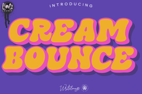
Cream Bounce is a premium display font built for impact, not explanation. It’s not trying to be neutral or invisible—it’s designed to be the first thing people notice in a fast-moving feed. Its rounded, almost squishy letterforms give off a joyful, analog warmth—think late-70s record sleeves meets modern UI energy. There’s no sharp contrast or rigid geometry here; instead, soft terminals, open counters, and consistent stroke weight make it feel approachable, energetic, and intentionally unpolished in the best way.
As a display font, it thrives where typography needs personality: headlines, banners, callouts, and short campaign labels. It’s not meant for body copy, product descriptions, or dense email text—and that’s by design. Its strength lies in how quickly it communicates mood: fun, confident, nostalgic but not dated, inclusive without being saccharine.
Where It Shines in Real Campaign Workflows
In practice, Cream Bounce has become my go-to for moments when visual hierarchy must do heavy lifting:
- Instagram Reels covers: Paired with a high-contrast background (think burnt orange on cream or navy on peach), it holds up even when scaled down to mobile preview size—no blurring, no lost shape definition.
- Pinterest pins: Its wide letter spacing and bold rhythm prevent crowding in vertical layouts, especially when overlaid on lifestyle photography.
- Digital ads (especially Facebook/Instagram carousel banners): Tested across devices, it maintains clarity at 24–36px headline sizes—even with light text on semi-transparent overlays.
- Email header graphics: Used as a single-line campaign tagline (“Your Summer Skills Start Here”), it adds instant brand texture without competing with CTAs.
- Webinar and course launch banners: Works especially well when anchoring a clean layout—e.g., Cream Bounce for the headline + a restrained sans serif (like Inter or Poppins) for date, time, and speaker details.
One unexpected win? Using it sparingly in branded template packs—like labeling “Bonus Module” or “Quick Tip” in a downloadable workbook. It signals value without shouting, and feels handcrafted rather than stock.
Readability Reality Checks (Yes, It’s Not Magic)
Let’s be practical: Cream Bounce performs best at 28px and up on desktop, and 32px+ on mobile previews. Below 24px, some characters (like the lowercase ‘e’ or tight ‘r’) start to lose distinction—especially against busy backgrounds or low-contrast color combos. On dark mode previews or Instagram Stories with gradient overlays, I always test with a 1–2px white stroke or subtle drop shadow to preserve shape integrity.
It also demands thoughtful background pairing. Avoid placing it directly over complex patterns or mid-tone textures unless you add a solid color block behind the text. Light-on-dark works beautifully if the background is deep and uniform (navy, charcoal, black). For light backgrounds, stick to warm off-whites or soft pastels—not stark white, which can flatten its dimensionality.
Smart Pairing & Practical Setup Notes
I consistently pair Cream Bounce with a highly legible, neutral sans serif—Inter, Manrope, or even the system font stack (San Francisco / Segoe UI / Roboto) for digital-first projects. The contrast between its playful weight and their clean efficiency creates strong visual breathing room. Never pair it with another decorative display font or a delicate script—that’s visual noise, not harmony.
Before deploying in client work or templates, I always check:
- File formats included: OTF and WOFF2 are essential for web use; TTF for print or Canva uploads.
- Weight options: Cream Bounce ships with one robust weight—ideal for consistency, but means you’ll rely on size, color, and spacing for hierarchy, not bold/regular variants.
- Ligatures & alternates: A few smart ligatures (like “ff”, “fi”) and stylistic alternates (swash caps, alternate ‘g’) add polish—but only enable them selectively, not globally.
- Licensing: Confirm commercial use rights cover digital ads, client deliverables, and resale in template kits—some display fonts restrict redistribution.
- Language support: Covers Latin-based languages well, but doesn’t extend to Cyrillic or extended diacritics—fine for most English-first campaigns, but verify if targeting broader regions.
When to Pause and Choose Something Else
Cream Bounce isn’t a universal solution—and that’s okay. Skip it for:
- Formal brand announcements (e.g., investor updates, policy changes)
- Long-form social carousels requiring paragraph readability
- Small-label applications (like packaging tags or app UI buttons under 16px)
- Campaigns leaning into minimalism, luxury, or clinical precision
It’s a deliberate choice—not a default. And that intentionality is exactly why it elevates creative font selection from decoration to strategy.