Blone: A Bold Display Font That Commands Attention
Last week, I was refining the hero section of a boutique online store’s new product landing page—clean layout, soft photography, minimalist navigation—and something felt off. The headline lacked presence. Not just size or color, but weight. Confidence. I swapped in Blone, and instantly, the page settled into place. It wasn’t louder—it was clearer. That’s the quiet power of a well-chosen display font.
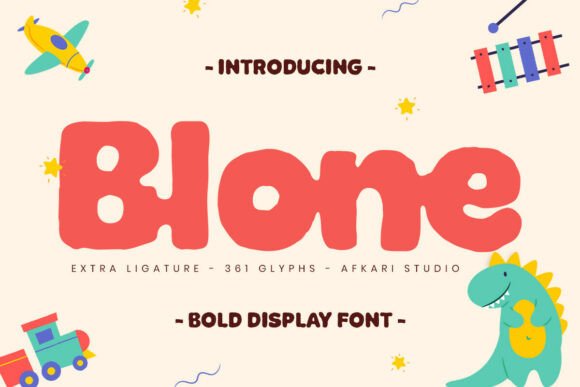
Blone is a modern display font built for impact—not noise. Its thick letterforms anchor the eye without sacrificing rhythm; its solid structure gives stability to bold statements; and its contemporary proportions keep it feeling fresh on screen, not dated or overly decorative. It doesn’t whisper “creative”—it says it with intention, then steps back so your message leads.
I tested Blone across several real scenarios: a coaching website’s headline over a subtle gradient, a digital brand kit’s section headers, and even as oversized text in a responsive blog header. In every case, it held up beautifully at scale—but only where it belonged. Blone isn’t meant for paragraphs or navigation menus. It’s a spotlight font: best for hero titles, section headings, call-to-action banners, shop feature cards, and campaign headlines. Think of it like a strong opening line in a conversation—memorable, purposeful, and never overstaying its welcome.
On mobile? I kept it to short phrases only—no more than five words in the hero. At 48px on desktop, it scaled cleanly down to 32px on tablets and 28px on phones without losing legibility. But here’s what mattered most: contrast. On light backgrounds, Blone’s density shines. Over image overlays, I added a subtle semi-transparent dark bar behind the text—or used a light stroke (via CSS text-stroke) when needed. Never tried it on pure black with white text without testing first: the thickness can blur slightly at smaller sizes if contrast isn’t dialed in.
Readability isn’t just about size—it’s about breathing room. With Blone, generous letter-spacing (0.03em–0.05em) helped maintain clarity, especially in all-caps usage. And while it works brilliantly for buttons (“Get Started”, “Join the Waitlist”), I avoided using it for small CTAs under 20px—even with optimized spacing, it starts to feel heavy rather than commanding.
Pairing Blone was intuitive. For body copy, I reached for a neutral, highly legible sans serif—something like Inter or Manrope—with enough x-height and open counters to balance Blone’s assertive stance. No need to overthink it: clean + bold = clarity. For a more editorial or premium feel—say, on a course sales page or creative portfolio—I paired it with a restrained serif like Literata or IBM Plex Serif. The contrast elevated both fonts: Blone gave energy; the serif grounded the experience in trust and craft.
What surprised me most was how consistently Blone shaped perception—not just of the typography, but of the brand itself. On a wellness coaching site, it lent authority without coldness. On a handmade ceramics shop’s banner, it felt artisanal yet polished. It doesn’t scream “trendy”—it feels considered. That’s rare in display fonts, which often lean too far into personality at the expense of versatility.
Before dropping Blone into production, I checked three things: webfont availability (WOFF2 included), licensing scope (commercial use covered, no hidden restrictions), and language support. It handles Latin-based languages well—including accented characters used in French, Spanish, and German—so it worked smoothly across multilingual sections of the client’s site. No surprises in the build: lightweight files, no render delays, and full compatibility with modern CSS font features like font-display: swap.
I also looked closely at what came in the package. Blone ships with a single, tightly tuned weight—intentionally. That’s a strength, not a limitation. It means no decision fatigue around “which bold is boldest?” Just one confident voice, ready to lead. Some designers might miss alternates or stylistic sets, but for digital interfaces where consistency trumps ornamentation, that singular focus is refreshing.
In practice, Blone earned its place in my go-to display font folder alongside other trusted tools—not because it’s flashy, but because it solves a real problem: how to make hierarchy feel effortless. When users land on a page, they scan in milliseconds. A strong headline in Blone tells them, immediately, what matters—and why they should stay. That’s not just visual design. It’s UX-adjacent storytelling.
It’s also worth noting: Blone doesn’t try to be everything. It won’t replace your body font. It won’t work in tight navigation bars or complex data tables. But in the moments that define first impressions—hero sections, email headers, social banners, course launch graphics—it delivers precision, polish, and presence. That’s the mark of a truly useful display font.
If you’re building a portfolio site, launching a digital product, refreshing a blog’s identity, or designing a campaign landing page, ask yourself: where does your content need to stand out—not just be seen, but be felt? That’s where Blone belongs. Not everywhere. But exactly where it counts.
- Best for: Hero headlines, section titles, CTA banners, shop feature cards, campaign graphics
- Avoid for: Body copy, navigation labels, small buttons (<20px), dense lists
- Pair with: A legible sans serif (e.g., Inter, Manrope) or a refined serif (e.g., Literata, IBM Plex Serif)
- Check before use: Webfont formats (WOFF2), commercial license terms, language coverage, responsive behavior at key breakpoints