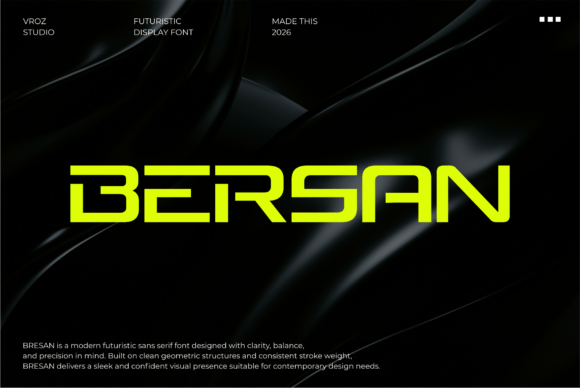
Bersan: A Futuristic Display Font That Elevates Digital Branding
It started with a hero section—just me, a half-finished landing page for a boutique coaching site, and that familiar pause before committing to a headline font. I’d tried three options already: one too soft, one too generic, one with awkward spacing at 48px on mobile. Then I dropped Bersan into the mockup—and everything clicked. Not just visually, but *functionally*. That’s rare for a display font.
What Makes Bersan Feel Like a Thoughtful Design Partner
Bersan is a modern sans serif display font built for clarity first. Its geometric structure isn’t rigid—it breathes. The clean cuts and smooth transitions you’ll notice in letters like “S,” “G,” and “a” give it precision without sterility. It feels futuristic, yes—but grounded in usability. Think of it as the typeface equivalent of a well-designed dashboard: intuitive, confident, and quietly sophisticated. As a display font, it’s not meant for paragraphs or microcopy. But for headlines, section titles, CTA buttons, and branded visual anchors? It delivers presence and polish in equal measure.
How It Performs Where It Matters Most
I tested Bersan across real layout scenarios—not just in Figma, but live in browser previews, on iOS and Android, and inside actual CMS previews (Shopify, Webflow, and a custom WordPress theme). Here’s what stood out:
- Hero text at scale: At 64px on desktop and 42px on mobile (with responsive sizing), Bersan held its shape beautifully—no letter collisions, no odd kerning gaps, even with all-caps phrases like “Clarity Starts Here.”
- Image overlays: Over a softly blurred lifestyle photo, Bersan’s even stroke weight and open counters kept text fully legible—even with subtle drop shadows or light text-on-dark variants.
- CTA buttons: On a pastel background, the medium weight gave enough visual weight without shouting. Paired with proper line-height and padding, it felt inviting, not aggressive.
- Section dividers: Used sparingly as small caps above a testimonial block (“Trusted by Creators”), it added rhythm and hierarchy without competing with the content.
Crucially, it rendered crisply across browsers—including Safari’s sometimes finicky font rendering—and loaded quickly when served as WOFF2. No flicker, no fallback jank.
Where Bersan Shines (and Where to Pause)
Bersan excels where impact and intention matter: landing page headers, course sales pages, portfolio project titles, brand kit cover slides, campaign banners, and digital ad creatives. I used it for a limited-edition workshop sign-up banner—and the clean geometry made the date and CTA feel intentional, not cluttered.
That said, it’s not a workhorse font. Don’t use it for:
- Body copy (even short paragraphs)—its design prioritizes form over flow for extended reading.
- Navigation menus or footer links—too decorative at small sizes; readability drops below 16px.
- Form labels or error messages—clarity and accessibility come first there.
- Dense dashboards or data tables—stick with neutral, highly legible sans serifs like Inter or Open Sans.
If your site needs both personality and practicality, Bersan works best as the top layer of your typographic system—not the foundation.
Smart Pairings & Practical Integration Tips
For web use, Bersan pairs effortlessly with clean, humanist sans serifs: Inter, Manrope, or Work Sans for body text and UI elements. Their warmth balances Bersan’s precision without diluting its character. I avoided pairing it with high-contrast serifs or ornate scripts—they compete rather than complement.
Before deploying, I checked the font package: it includes regular, medium, and bold weights (no italics, which is fine—this isn’t a body font), supports Latin Extended-A (covers most European languages), and comes with WOFF2, WOFF, and variable font options. Licensing is clearly stated for commercial web use—no surprises for client sites or SaaS products.
A few real-world notes: On dark mode, Bersan’s medium weight reads cleanly against charcoal or deep navy—but avoid pure black backgrounds unless you’re using a slightly lighter weight or adding subtle text shadow. And always test contrast ratios: at 32px+, it passes WCAG AA on most backgrounds, but verify with your own palette.
More Than Just Style—It Supports Your Brand Story
What surprised me most wasn’t how sharp Bersan looked—but how consistently it reinforced tone. On a coaching site, it communicated calm confidence. On a creative studio’s portfolio, it felt forward-thinking but never cold. On a sustainable product launch page, its clean geometry subtly echoed values like transparency and intention.
That’s the quiet power of a well-chosen display font: it doesn’t just say *what* you do—it quietly affirms *how* you show up. Bersan doesn’t shout for attention. It earns it—through clarity, consistency, and thoughtful design execution. For anyone building a digital presence where every pixel carries meaning, it’s less of a font choice—and more of a strategic alignment.